Paint Color Choices - What Would Bette Midler Or Bill Blass - Or You - Choose


A colorful personality herself, Bette Midler says she loves to use color as a design element in her home environments. "I love color." According to Ms. Midler, "I don't care where it comes from . . . walls, flowers, anything. Color is a subliminal source of joy and happiness that sets off something that lifts your spirits."CELEBRITIES FIND INTERIOR DESIGNER DIRECTORY OR DECORATOR OR LOCAL INTERIOR DESIGNER

Just like Bette Midler, most of us love color, so what's up with choosing a paint color. It's not for lack of beautiful choices - it is said the human eye recognizes at least ten million colors. The issue is more amongst so many beautiful colors, how do we decide which colors to paint in our home. Rest assured, not to worry. If you can't decide what colors to paint your kitchen or bathroom, don't feel bad. Color has more to do with emotion than with technicalities. HOW TO FIND AN INTERIOR DESIGNER.

Think about what color does. It pulls you in, or pushes you away. It can easily shock. Or calm.SOMETHING BEAUTIFUL DESIGN DIRECTORY FIND INTERIOR DESIGNER


Have you noticed a particular color that repeats in your clothes closet? Learn to trust yourself that you know you love certain colors and let your eye and instinct lead you.

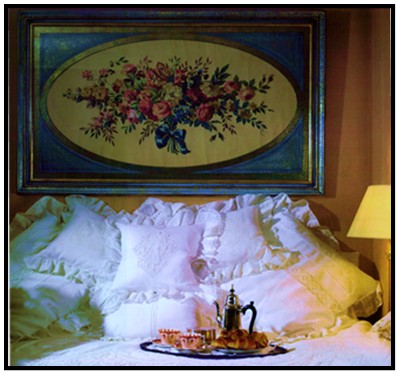
Color has energy - pediatric wards are often painted bubble-gum pink to soothe children. Blue is known to lower blood pressure, ideal for a meditative space. The yellow legal pad comes from the belief that yellow stimulates the intellect and the memory.

Take your time. Peruse decorating magazines and note similarities of colors of rooms that you enjoy. Note rooms that instill various emotions such as beauty, restfulness, comfort, etc. INTERIOR DESIGN IDEAS DE SIGN IDEAS?


Realize you may have already identified colors that are beautiful to you. Look around your home, you may have a favorite vase, a distinct pillow or a cherished personal item . . . consider its colors. There are reasons we love the things that we love and color may just be why these items are precious to you.HOW TO HIRE AN INTERIOR DESIGNER OR FIND A DESIGNER


Patricia,Editor FIND INTERIOR DESIGN ARTICLE BEAUTIFUL


Photographs from Christy Ferer's book Breaking the Rules: Home Style for the Way We Live Today FIND OUR LATEST INTERIOR DECORATING ARTICLE

Focal Points Are Vital In A Well Designed Room

Sometimes it’s the ‘biggest’ feature in the room. Oftentimes it’s a fireplace, a picture window or a built-in bookcase. It wants to be special, it wants to be dramatic. If it is played up, this focal point helps to make your room more inviting, offering a more comfortable place to rest. Since this one design item can do so much, play it up! DECORATING IDEAS AND PROJECTS TIPS
Determining Your Focal Point: HOW TO CHOOSE COLOR
A focal point should be something interesting to look at, something colorful or texturally and visually appealing. You can create a focal point for the room, by focusing on artwork, floral arrangements, paint color, or shelving. It should be the 'first thing' you see when entering a room. If possible, build your furniture arrangement around it.
Play Up Your Focal Point:
You can create a focal point wall by painting one wall a different color from the rest and accessorizing with a wall arrangement, artwork, or display shelves. Use lighting to enhance your focal point. For example, use a picture light, track light, or wall washer fixture on a painting or wall display. If you've identified a mantle or shelf as the focal point, use plants and accessories to decorate them.
Use contrasting color to make the focal point stand out. For example, use a light wall color behind a dark wood focal piece.
A Neat Niche:
What could have been an awkward niche has become a focal point by filling it with interesting pieces. A mural is seen here, but you might also use a painting or a collection of prints. The Asian-style dresser is topped with a few simple accessories and a pair of lamps, while recessed lighting is focused to brighten the mural.

Lady's Master Bedroom Designer: Chris Garrett / Garrett Paschen Ltd, Evanston, IL From the 2003 Lake Forest Showcase House and Gardens Photo ©2003, Glenna Morton, About Interior Decorating

Guest Rooms That Truely Welcome Your Visitors


In planning spaces in our home for overnight guests our ultimate goal is to offer a place that is warm and welcoming. Some home situations allow dedication of an entire guest cottage or retreat, more often it is a guest room and sometimes that guest room has the unique challenge of having to serve combined uses, both an office and as a guest room. I am happy to tell you that with smart planning and creative decorating it is possible to transform almost any space into a comfortable retreat for guests.


Minimum planning requirements for a guest room would include:


  • A good bed, one that is comfortable, and a good supply of pillows and blankets.

  • Sufficient lighting, such that meets the needs for people who are sharing the room but who may have different nighttime routines, for instance provide individual light sources that can be turned on and off from each side of the bed.

  • Window coverings - even if your guest room has a beautiful view, it still needs window coverings to allow for privacy, light control and even control of room temperature.

  • Comfortable seating that invites guests to rest, read or write. An overstuffed armchair with an ottoman is a good choice.

Good design for a guest bedroom would require it to be comfortable and welcoming for guests, while mixing well with the balance of the living areas.

In the photo above, while planned and decorated as a handsome guest room, this retreat is a dual use room as it also is the homeowner's private sitting room between guests. The secret to such easy transition? An upholstered daybed that's equally enticing for overnight guests and daytime relaxing. This scheme is a sophisticated blend of beiges, tans, taupes and whites. The mirror is a key element to over the top and still subtle grace.

In the other photo here, we see a crisp white batten lace bedding ensemble. It draws us, even entices us, offering comfort and warmth. In fact it is just a day bed with a bit of decor. If we compare this photo with the above photo, this room is more feminine and has a Victorian look. The sumptuous bed and tray filled with teapot, teacups and scones are hard to resist. I can envision an afternoon with a great piece of literature and perhaps an afternoon nap as well.

For fun, if we look at the batten lace guest bedroom again, imagine if we were to switch out the traditional floral artwork ... and what if we were to replace it with either of the two contemporary, colorful prints that are shown in the column on the right in this blog. You will see they are ("Landscape with Trees and Pond" or "Red House"). Opening our mind's eye, we would see that despite keeping the distinct crisp white batten lace bedding, changing the artwork with either of these pieces would profoundly alter the feel of the guest room. It gains a certain whimsy and joy. I even imagine the scones would taste different. What do you think? Do you see it?

We want guest rooms to be private retreats for our visiting family and friends but it is equally important guest rooms should mix well with the adjoining areas. For a guest room to be a feast for the eyes for the homeowners, they shouldn't have to live in these same rooms to feel its beauty and rever it. The 'genuine seeing experience,' the excellent mix, the satisfaction is simply in the moment of engaging that room and its beauty, and that energy connection that it is set aside for very special times with very loved ones. The dynamics of those special moments can derive from good planning and good design.

Patricia, Editor

Do you have questions about a guest room or another room in your house? Submit your issue in the 'Ask The Designer' Section and one of the designers (or more) will provide feedback.

Ann Sacks Womens Bathroom & Showroom On Display

Ann Sacks - Back in 1980, a pioneering Oregonian stumbled across some Mexican Talavera tile she thought she could sell. Twenty-seven years later, Ann Sacks (now owned by Kohler) is the first and last name in luxury tile, stone and bath fixtures, and boasts a gleaming new Dallas Design District showroom to display it all to perfection.


Located just across the street from the company's previous location, the new, 4,200-square-foot space is a veritable shrine to surface design. Natural light floods through the floor-to-ceiling windows, illuminating tiles of every shape, size, description and color. One particularly shining example: the Davlin glass line, made from sheets of gold leaf pressed under glass and priced about $209 a square foot.


"Color is so important in fashion, so we were looking for sophisticated ways to use color in the home," says Michael Merritt, director of merchandising for the company. Pattern is also key, as evidenced in the David Hicks-inspired interlocking circles of blue Macauba stone and black Nero Marquino marble ($250 a square foot) called Beau Monde, and an amazing selection of hand-painted mosaics reproduced from 14th-century Ottoman Empire designs and sealed using glazes made from crushed quartz and semi-precious stone.

Which brings us to the women's bathroom. We normally wouldn't suggest a sightseeing detour to a powder room, but the white and gold-mirrored "Reindeer Damask" custom mural by Fort Worth native Erin Adams is totally worth the trip.


Trivia tidbit: Founder Sacks still lives in Portland, where she and daughter Amy are partners in the upscale eyewear brand Amy Sacks. The label's chic (truly) reading and sunglasses are sold locally at Neiman Marcus.
Ann Sacks, 1616 Oak Lawn Ave., 214-742-8453, annsacks.com


ELIZABETH M. CLAFFEY/Staff Photographer & CARTER ROSE/Special Contributor for ezine magazine Dexigner


Note: Something Beautiful Note: When in Dallas, be sure to look up Interior Designer Di Marie of Dallas Interiors At Legacy.


How To Hang Art & Display Objects On Shelves.

Grouping items and displaying artwork well is a skill, but it is one that can be learned through practice, and a bit of guidance. The following tips can serve as a guide to get you practicing creating artwork displays.There is no right or wrong! Have fun!
On building a gallery of artwork and objects using shelves: Odd numbers of frames (i.e., three, five or seven frames) create the most pleasing effect in a display. Place central pieces at eye level or slightly above on the wall, then expand your display outward from there.
To add interest and character to a collection of similar art pieces, use frames in a variety of colors, textures and shapes. Interspersing the display with mirrors helps break up repetition, and creates the illusion of amplified natural light.
Hang several shelves to create a gallery of artwork and objects. Place framed or un-framed artwork on the shelves to lean against the wall, and . . .


Add eye-pleasing items (found river rocks,sculptural

vases, or vintage children's toys, for example) that

play off the shapes, colors and textures of the artwork.


Use wall ledges as a framework for an ever-evolving mix framed artwork. Aside from protecting your walls from misplaced holes, ledges also provide the freedom to layer artwork so that one frame slightly overlaps the other. This technique puts the focus on the display as a whole, rather than on any individual piece.
(A quick note as I look at this picture is that it has balance. If we draw a verticle line down the middle, both sides are visually equally balanced. A easy check to see if the picture is in fact balanced, is flip the picture around. If it is balanced, it will be balanced either way. Again, practice it. Imagine as you go about your day, as you pass pictures and artwork, look for balance, flip the pictures (in your mind, not really!)

Home Improvement Design Concepts (Balance)


Often designers arrive at initial consultations where the potential client has spent a good deal of money and yet to be satisfied with the results. Clients with a dream-room in mind, spent alot of money, but no dream. The client loved the detailed bookcases, French side chairs, etc., and you know the pieces were not cheap. Still . . . it just doesn't feel right. It is almost painful that it isn't working, after so much effort.
In creating and reviewing the design of a room, balance must be achieved. Balance is equilibrium, the distribution of equal weight; and if missing in our surroundings, we feel uneven, perhaps even anxious. Balance makes us comfortable, gives us stability. It reduces stress and gives us peace. Understanding the balance is a great example of how we experience and interact with our environments.

As we enjoy a picnic site and find it beautiful and relaxing, we notice it is a sunny day, the blue sky above and a landscape of nature surrounding us. Were we to take the same site but locate it on a slight incline, the calm and harmony evaporates. When we enter a room and notice a tilted picture on a wall, the desire to want to march over and correct it is because we need equilibrium, we need balance. A carpenter installing beautiful new wood flooring will avail himself of his level to assure that his composition, the completed flooring job, has balance.

The creation of a beautiful room
is not much different than the
creation of a beautiful painting
.

Painters are aware of the need for balance and will sometimes create an imaginary vertical line down the middle of a canvas, to help assure the counterbalancing or evening of the elements of the composition. We too can use a similar technique by imagining a vertical chalked plumb line down the middle of a wall - our composition.
In balance, it is ‘visual’ weight that we are considering. The more an element attracts the eye, the more it 'weighs.' In seeing balance between a bright red balloon and a black bowling ball, the balloon might have more visual weight than the black bowling ball.When teaching your eye to see visual weight, it might help to see the room from a different perspective than we do everyday. You could walk back from a particular wall about fifteen feet and as you look at the pieces, slightly squint your eyes. This technique is similar to adjusting a camera lens. By adjusting your focus, you will see that the items will either be visually drawn toward you or they will fade to the background. Those items that are drawn toward you, or that your eye perceives as stronger have more visual weight.
It is through adjusting the elements on either side of the imaginary vision line, through evening them, that we achieve balance. Understanding that balance creates harmony and comfort is vital in our journey to learn how to create beautiful rooms and how
to create beautiful rooms for us.


This article is one in a series of Design Concepts, to go to the entire list, click here.

Decorating With Pictures

Hung against knotty pine,
this collection of pictures (in a
small guest bathroom) makes
for a beautiful retreat.


All my life my way of thinking has been hugely affected by the things around me, especially in the display of picture collections. From uniquely framed poster art to musuem-quality still lifes, I have always absorbed an awareness of beautiful things, and particularly pictures.
Fabrics, imported china, rugs and all decorator items are fascinating and essential to our interiors. But to me, it is pictures that are the soul of the house. Artwork on display says a great deal about the character of the owner. A collection of pictures brings extraordinary sense of originality and uniqueness.
People are often nervous when starting a picture collection that it make a statement. If you are a bit reticent, consider the following ideas: Open your eyes. Look around you. Study picture collections of local museums, art galleries, antique shops, etc.
As you browse the homes of top decorators and art collectors displayed in pages of design magazines, notice the artwork of a particular room. What sort of pictures do they collect? Is there a particular theme (such as nautical). Is it a mix of different media and different subject matter, such as in the photos above.
You will start to develop confidence in building your collection of pictures based on your personal tastes. Flirt with the concept of 'what would happen if ....' you made small changes to the vignette shown in a photo. What might occur if the framing were altered. Consider what might happen if a particular large piece were moved. Does that picture’s placement need to be there to ‘hold’ the grouping together. Don't worry about the aesthetic dictates of others. Pictures for your home collection should appeal to you.

~ Patricia Loya ~


Decorating Color Trends


Designer Steven Gambrel describes how he used some of the new color trends. Pantone Paint's Winter Sky was used on the walls and the edges of the walls were 'outlined' with the richer hue, Niagara to add architectural interest (in lieu of crown molding). According to Gambrel, "The Winter Sky And Niagara Slate blues have a slight tension that makes this combination interesting." He adds, "I never paint walls white." (Photo, left)

Walls: Winter Sky,

Border: Niagara, Pantone Paints


A vibrant family room or library: pale teal walls, a tobacco ceiling, plum trim. Accent with: nubby textiles and woven-straw accessories.

Wall: Hyacinth Dream #22-10 Paint

Trim: Ombre #31-20 Paint


Ceiling:Wendigo #33-18all,


Fabric: Kravet


"I'm painting my dining room these cream and aubergine colors and putting nail-head-studded burlap on the door," according to Designer Ruthie Sommers

Eggplant walls: trimmed with luscious off-white trim:

Pointing #2003, Farrow & Ball for stores

Walls: Eggplant #1379, Benjamin Moore for stores

Karin Blake - Architectural Digest Top 100

xxx xxxx

Minimalist and Americana and/or folk art aren't often paired - but designer Karin Blake has been combining them successfully for awhile. She's been on the "Architectural Digest Top 100 Interior Designers List" since its inception and she was a minamalist before there was even a word for it. Restraint is Karin Blake's signature.

The Malibu, California-based designer is a true believer in Mies van der Rohe’s philosophy that less is more. “I value negative space,” says Karin Blake, whose concise, highly edited interiors combine the whimsy of folk art with the precision of Modernism. The designer, who has many art collectors among her clientele, notes that there is a “gallery” feel to her interiors. “There’s not a lot of clutter,” she says. “Each piece stands out, even if it’s a table. I even avoid lamps whenever possible."


Speaking of the Cape Cod summer home she purchased three years ago, ”My children were being raised in California, it was important to get them out, to get to know the East Coast.” Especially Maine. “Maine attracted me because it doesn’t have the crowding and commercialization that’s happened in other areas. I had a little farm on Martha’s Vineyard, which I stupidly sold. When I lived there, the island was so charming, making what has happened since so sad. Maine, however, filled that void.” She pauses, laughing, “No T-shirts.”
Though the original house sat lakeside on over 100 acres, “the place was in terrible condition. The floors were a mess, it needed painting inside and out, and we had to gut the kitchen. Beyond that, the two barns had to be completely salvaged.”
“I love strong, primary colors,” Blake says. “A little bit of red in every room really helps.”
A daunting task but one Blake jumped on, ultimately creating a 15-odd-room (tiny ones notwithstanding) summer vacation haven, a much-improved version of the original home, where she and her family spent “at least a month every summer.” Even more personally, its warren of rooms provided the perfect backdrop for the true passion of this decorator’s life—collecting folk art. Indeed, a walk through its cascade of spaces is a flight of the imagination, a merry jaunt through whimsical Americana.


Karin Blake - Malibu, CA Phone: 310-456-8010 Fax: 310-456-1093


The above article is part of an ongoing series Highlighting Top Interior Designers; other top designers recently highlighted include: Jennifer Post *** Lillian August *** Carol Bolton Hicks *** Geoffrey Bradfield *** Paul Vincent Wiseman *** Sills Huniford Associates ***

Karin Blake is one of many hugely talented designers listed in our Directory of Designers . Feel free to peruse the Directory for help with your design project.

Architectural Digest


New Year, New Contest $500 Gift Certificate


  • $500 Gift Certificate The Villa Couture Boutique


  • Contest Ends January 31, 2011


  • To See The Villa Couture, a newly opening boutique, click here. Thank you The Villa Couture for sponsoring this contest along with Something Beautiful Journal.


  • How do I win? You must be registered on the Something Beautiful Journal - If you are not or not sure, sign up again, just to be sure, a sign up is located here on the right side of this page. That's it!


  • Can I enter more than once? Yes, first register as above and then, after that, you can enter as many times as you like by separately emailing ~ ~ contest@somethingbeautifuljournal.org stating: I WANT TO WIN! (Maximum of one entry per day.)


  • Not all 'sale' items are included in the contest; review with Contest Manager.

Click here to return to main page of Something Beautiful Journal.


Italian Style Farmhouse Designed To Look Old (Cont'd)


This house and its beautiful landscape was constructed from scratch.  Not one tree stood on the site. 

With its old, plush-looking landscape however,  it has a naturally-established look, as if seeds have scattered with the winds across the grounds.

What now has the appearance of an Italian Style farmhouse or old Tuscany estate was carefully constructed by a team of professionals led by Saint Dizier Design with attention to detail: 

  • creation of elegant rusticity, “a balance between dress-up and relaxed, a hodgepodge very carefully orchestrated,” according to Jacques Saint Dizier, of Saint Dizier Design
  • use of fieldstone that might have been dug from local earth 
  • capture vineyard panoramas, he raised the residence three feet to allow for stone terracing. "I’ve always felt that terracing merges architecture with the landscape,” he remarks, “so that you’re not sure where the stone walls become house.”
  • anchor the house with an array of gnarled trees with languorous branches as thought they've survived a hundred summers, reports landscape architect Frederika Moller
  • surround the property with masses of Teucrium and other herbs, confirming the house’s wine-country setting 
  • construct a bocce court (a long-time Italian pastime activity)
  • reinforce viewing areas of the 200 acres of grapes
  • The landscape has many moods, the result of the grand skills of landscape architect Frederika Moller.
  • To the rear, a series of outdoor rooms are formally defined by the rectilinear pool, pergola and bocce court.
  • Mediterranean plantings spill, climb and drape, blurring distinctions between the natural and the cultivated. A rose garden and a vegetable garden are enclosed by laurel hedges, bisected à la France by rose-lined pathways.


The High back woven chairs shown left are from Ralph Lauren Home, and it so happens that Saint Dizier Home Shop carries one of the largest collections of Ralph Lauren in the San Francisco area.


The pergola, pool and bocce court make for a perfect outdoor entertaining retreat.

And of course, this is a fine example of a Bocce court, an Italian ball sport, but played around Europe and also in overseas areas that have received Italian migrants.


Bonus Recipe:  For Outdoor Entertaining With An Italian Flair, "Brunschetta With Swiss Chard Pecorino
Cheese"

Outdoor entertaining Bruschetta, delicious grilled slices of crusty Italian bread topped with a myriad of toppings that can be prepared quickly and is often served as an antipasto.  This version is one of my favorites, you can use any green leafy vegetable such as Tuscan black cabbage, kale or spinach in place of the swiss chard as shown in the photo. The addition of buttery, toasted pine nuts or crispy pancetta bits to the topping would offer options to vary this dish nicely.

Bruschetta With Swiss Chard & Pecorino Cheese


Yield: Serves 4
Prep Time: 15 mins
Cook Time: 20 mins
Total Time: 35 mins
Bruschetta, delicious grilled slices of crusty Italian bread topped with a myriad of toppings that can be prepared quickly and is often served as an antipasto.

Ingredients:

4 Slices Crusty Italian Bread (Ciabatta Works Well)
1 Garlic Clove Peeled
Topping:
1 Large Bunch Of Swiss Chard
2 Cloves Garlic, Peeled And Minced
3 Tablespoons Extra Virgin Olive Oil
3 Tablespoons Minced Sun-Dried Tomatoes (I Prefer Oil Packed)
Salt & Pepper To Taste
Dash Of Red Pepper Flakes
1/4 Cup Shaved Pecorino Cheese

Directions:


Wash the swiss chard and dry it well, chop the leaves coarsely, and finely chop the stems.
Heat the olive oil in a heavy pan over medium heat, and then add the minced garlic and cook just until fragrant.
Add the swiss chard and cook until it is wilted and soft.
Add the sun-dried tomatoes, and then season with salt, pepper, and red pepper flakes.
Mix well, and then set aside.
Either grill the bread slices, or place under the broiler, lightly browning each side.
Place the peeled garlic clove on the tines of a fork and scrape it across each slice of toasted bread.
Divide the swiss chard mixture between the four slices of bread, and then top each with some of the shaved pecorino cheese.

From "Italian Food Forever," Buon Appetito! Deborah Mele


(Architectural Digest Photos, Architecture by c, AIA, and Karen Jensen Roberts, AIA/Interior Design by Jacques Saint Dizier, ASID and Richard Westbrook of Saint Dizier Design/Landscape Architecture by Frederika Moller Text by Patricia Leigh Brown/Photography by Mary E. Nichols Published June 2009 )

Art And Artwork On A Budget (Continued)


Click Here To Return To Original Article

Swiss Alberto Giacometti is noted for his bronze objects that are thin and elongated, almost appearing as if they were without weight and inertia, their meager impression is increased by the contrast with the rather compact bases that Giacometti places them on.  Alberto Giacometti found his own unmistakable style, giving his figures a maximum in expression by reducing and densifying them.  The relation between figure and space became the central issue of his artistic work.

Swiss Alberto Giacometti Shown With Some Of His Sculptures

I would like to offer up some sculptures that have a 'Giacometti-esque style'; they are also beautiful, but are more affordable.
 "Walking Horses," Affordable Art Sculptures
 Available From Something Beautiful Shoppe,
 the Tallest is 22.5" High and 23" Long


*
POST UPDATE:
This singular equine horse by Swiss Artist Alberto Giacometti , the "Cheval A La Tete Haute," French transl. of sculpture name is Horse With The Head High, is a bronze sculpture with a greenish brown patina, height is 6-5/8", circa 1978, sold at Christie's Auction for $39,175.

*End Post Update.


"Reaching For the Star," More Affordable Art Sculpture Available From Something Beautiful Shoppe
"Scooter," Sculpture More Affordable Art Sculpture Available From Something Beautiful Shoppe


Brian Kershisnik Contemporary Artist - Original Oil Paintings Sell for $50,000 Plus  

Dancing On A Very Small Island
"Dancing On A Very Small Island," Is Available As An Affordable Giclee Pigment Print Of An Original Oil Painting by Brian Kershisnik, Signed And Numbered By The Artist and Available at the Something Beautiful Shoppe

Stroll back up and note contemporary American artist Brian Kershisnik's "Young Astronomer," is the lead-in art for my article here.  Kershisnik's figures take on an ethereal, otherworldly quality, sometimes because of their apparent weightlessness, and at other times due to their quirky justapositions with other figures or props.  There is often a narrative element to the work, as if the viewer has just walked in on the delivery of the punch line to a joke that has just been uttered out of earshot.  His favorite themes tend to deal with family life and personal relationships. Though not overtly religious, some of his works have dealt with religious themes especially as they intersect family and personal relationships.

Brian Kershisnik artwork is hot and will only becoming hotter.

But, check this out - you can purchase limited edition, signed and numbered by Kershisnik, giclee prints at very reasonable amounts.


Brian Kershisnik
Brian Kershisnik is an American Contemporary Artist, Born in 1962, Who's Original Oil Paintings Are Going For $50,000 Plus.  Yeah, Kershisnik Has Some Talent


"Day Dreamer," figurative art piece by Jeanne Bessette

Emerging abstract and figurative artist Jeanne Bessette was featured in Art Business in an article entitled, "Success Out The Wazoo." The following is an excerpt from that publication.


"Jeanne is an emerging artist who is taking the East Coast by storm, and has now cast her eye on California.   With  9 galleries, and counting, she was on the  December cover of Art Business News, just landed two new commissions,contacted by even more galleries, approached by a school in British Columbia to teach workshops and a California agent  who works with placing art in corporations. Jeanne Bessette has this uncanny ability to wave a  magic wand, and viola!  Success."

Top Emerging Artists, "Art Business News," Jeanne Bessette (top row, 2nd from left)

"Woke Up Full Of Awesome," figurative art piece by Jeanne Bessette, Prints Available Summer 2013

Jeanne Bessette's art shown at the ArtEtude Gallery, Inc., located in Downtown Asheville, North Carolina

Jeanne Bessette's originals are more affordable, selling for under $10,000, she is considered an emerging artist whose paintings reside in numerous private collections in the United States and Canada. Ms. Bissette is an American contemporary abstract artist, her work influenced by Nathan Oliveira and Richard Diebonkorn. She works primarily in acrylics and mixed media.

Reminder:  Jeanne Bessette's prints will be available in Summer 2013.

Art collectors:  Keep your eyes on this woman.


Decorating with a rich palette is highly appealing but so often unfortunately exorbitantly expensive.  Artists that are on the rise (like Jeanne Bessette) offer originals that are more affordable as well as prints of her original artworks.  Similarly, Brian Kershisnik's magical art that is $50,000 plus can be in our living rooms, in limited edition prints, signed and numbered by him.  Again another approach to collecting art for our homes is purchasing high-style reproductions of original art pieces, like the Walking Horses Sculptures shown above, from the Something Beautiful Shoppe, that I call 'Giacometti-esque'.  They are high on appeal, at a lesser cost.

The Something Beautiful Shoppe is one of the few venues carrying art and artwork at affordable prices. 


Go embrace art and artwork for your home.


Karim Rashid - Profiled For Wearing One Color


(Article continued from front page, to return, click here.)


Karim Rashid Industrial Designer. White half the time, pink half the time.


Why white? In college, I was obsessed with wearing all white. I felt angelic and free. But then, in the early eighties, I started wearing black. That was status quo in the avant-garde. If you were interesting—a designer, an architect—you wore all black.
How long did that last? I went to Rome to do my master’s in ’82. I wore all black, with pink hair. But that was considered Fascist. I had to tone down my dress.
Why didn’t you return to black back in New York? Every profession has dress codes. In 2000, I was on a panel with nine architects, and I wore a white suit. Everyone was wearing black except me. I felt detached from the incestuous profession.
Now you also wear pink. Why? Sometimes I think it’s because my mother dressed me in pink when I was a child. She wanted me to be a girl.
How do people react to a grown man in pink?I make them smile. They say, “You make me happy.”

SILLS HUNIFORD ASSOCIATES


"Creating a home with great style, one both
beautiful and efficient, is no simple task."
About: Sills Huniford Associates has an extraordinary talent for transforming interiors with furniture and furnishings from the 17th, 18th, 19th, and 20th centuries to create environments for modern living. Sills and Huniford find inspiration in 17th and 18th century furniture, old masters paintings, Italian, Belgian, French and Austrian architecture.

Namedropping clients: Nan Swid, Vera Wang, Anna Wintour, Yves André Istel, Linda Wells, The Newhouse family, Tina Turner, Jane Pratt, Brooke DeOcampo, Lauren and Richard Dupont, The Starwood Properties/St. Regis and The Rockefeller family. Sills Huniford Associates projects have appeared in numerous publications including Architectural Digest, Elle Décor, House & Garden, World of Interiors, Vogue, Maison & Jardin, W, Italian Elle Décor, French Elle Décor, British House & Garden, New York Magazine, The New York Times, Harper's Bazaar and the Herald Tribune.
SHA Bedford Home Project, Click Here For More Info.
SHA Aspen Home Project, Click Here For More Info.

*Postnote:  Sills Huniford Associates partnership has since dissolved, I bring you this portfolio, but offer up Stephen Sills Associates as an alternative.  To view the SHA portfolio including residential and contract work, click here.


Click here for info on ordering Sills Huniford book, "Dwellings: Living With Style."