Focal Points Are Vital In A Well Designed Room

Sometimes it’s the ‘biggest’ feature in the room. Oftentimes it’s a fireplace, a picture window or a built-in bookcase. It wants to be special, it wants to be dramatic. If it is played up, this focal point helps to make your room more inviting, offering a more comfortable place to rest. Since this one design item can do so much, play it up! DECORATING IDEAS AND PROJECTS TIPS
Determining Your Focal Point: HOW TO CHOOSE COLOR
A focal point should be something interesting to look at, something colorful or texturally and visually appealing. You can create a focal point for the room, by focusing on artwork, floral arrangements, paint color, or shelving. It should be the 'first thing' you see when entering a room. If possible, build your furniture arrangement around it.
Play Up Your Focal Point:
You can create a focal point wall by painting one wall a different color from the rest and accessorizing with a wall arrangement, artwork, or display shelves. Use lighting to enhance your focal point. For example, use a picture light, track light, or wall washer fixture on a painting or wall display. If you've identified a mantle or shelf as the focal point, use plants and accessories to decorate them.
Use contrasting color to make the focal point stand out. For example, use a light wall color behind a dark wood focal piece.
A Neat Niche:
What could have been an awkward niche has become a focal point by filling it with interesting pieces. A mural is seen here, but you might also use a painting or a collection of prints. The Asian-style dresser is topped with a few simple accessories and a pair of lamps, while recessed lighting is focused to brighten the mural.

Lady's Master Bedroom Designer: Chris Garrett / Garrett Paschen Ltd, Evanston, IL From the 2003 Lake Forest Showcase House and Gardens Photo ©2003, Glenna Morton, About Interior Decorating

Guest Rooms That Truely Welcome Your Visitors


In planning spaces in our home for overnight guests our ultimate goal is to offer a place that is warm and welcoming. Some home situations allow dedication of an entire guest cottage or retreat, more often it is a guest room and sometimes that guest room has the unique challenge of having to serve combined uses, both an office and as a guest room. I am happy to tell you that with smart planning and creative decorating it is possible to transform almost any space into a comfortable retreat for guests.


Minimum planning requirements for a guest room would include:


  • A good bed, one that is comfortable, and a good supply of pillows and blankets.

  • Sufficient lighting, such that meets the needs for people who are sharing the room but who may have different nighttime routines, for instance provide individual light sources that can be turned on and off from each side of the bed.

  • Window coverings - even if your guest room has a beautiful view, it still needs window coverings to allow for privacy, light control and even control of room temperature.

  • Comfortable seating that invites guests to rest, read or write. An overstuffed armchair with an ottoman is a good choice.

Good design for a guest bedroom would require it to be comfortable and welcoming for guests, while mixing well with the balance of the living areas.

In the photo above, while planned and decorated as a handsome guest room, this retreat is a dual use room as it also is the homeowner's private sitting room between guests. The secret to such easy transition? An upholstered daybed that's equally enticing for overnight guests and daytime relaxing. This scheme is a sophisticated blend of beiges, tans, taupes and whites. The mirror is a key element to over the top and still subtle grace.

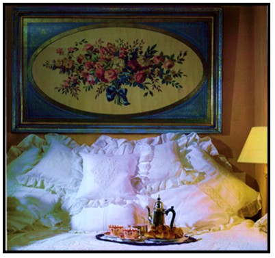
In the other photo here, we see a crisp white batten lace bedding ensemble. It draws us, even entices us, offering comfort and warmth. In fact it is just a day bed with a bit of decor. If we compare this photo with the above photo, this room is more feminine and has a Victorian look. The sumptuous bed and tray filled with teapot, teacups and scones are hard to resist. I can envision an afternoon with a great piece of literature and perhaps an afternoon nap as well.

For fun, if we look at the batten lace guest bedroom again, imagine if we were to switch out the traditional floral artwork ... and what if we were to replace it with either of the two contemporary, colorful prints that are shown in the column on the right in this blog. You will see they are ("Landscape with Trees and Pond" or "Red House"). Opening our mind's eye, we would see that despite keeping the distinct crisp white batten lace bedding, changing the artwork with either of these pieces would profoundly alter the feel of the guest room. It gains a certain whimsy and joy. I even imagine the scones would taste different. What do you think? Do you see it?

We want guest rooms to be private retreats for our visiting family and friends but it is equally important guest rooms should mix well with the adjoining areas. For a guest room to be a feast for the eyes for the homeowners, they shouldn't have to live in these same rooms to feel its beauty and rever it. The 'genuine seeing experience,' the excellent mix, the satisfaction is simply in the moment of engaging that room and its beauty, and that energy connection that it is set aside for very special times with very loved ones. The dynamics of those special moments can derive from good planning and good design.

Patricia, Editor

Do you have questions about a guest room or another room in your house? Submit your issue in the 'Ask The Designer' Section and one of the designers (or more) will provide feedback.

Ann Sacks Womens Bathroom & Showroom On Display

Ann Sacks - Back in 1980, a pioneering Oregonian stumbled across some Mexican Talavera tile she thought she could sell. Twenty-seven years later, Ann Sacks (now owned by Kohler) is the first and last name in luxury tile, stone and bath fixtures, and boasts a gleaming new Dallas Design District showroom to display it all to perfection.


Located just across the street from the company's previous location, the new, 4,200-square-foot space is a veritable shrine to surface design. Natural light floods through the floor-to-ceiling windows, illuminating tiles of every shape, size, description and color. One particularly shining example: the Davlin glass line, made from sheets of gold leaf pressed under glass and priced about $209 a square foot.


"Color is so important in fashion, so we were looking for sophisticated ways to use color in the home," says Michael Merritt, director of merchandising for the company. Pattern is also key, as evidenced in the David Hicks-inspired interlocking circles of blue Macauba stone and black Nero Marquino marble ($250 a square foot) called Beau Monde, and an amazing selection of hand-painted mosaics reproduced from 14th-century Ottoman Empire designs and sealed using glazes made from crushed quartz and semi-precious stone.

Which brings us to the women's bathroom. We normally wouldn't suggest a sightseeing detour to a powder room, but the white and gold-mirrored "Reindeer Damask" custom mural by Fort Worth native Erin Adams is totally worth the trip.


Trivia tidbit: Founder Sacks still lives in Portland, where she and daughter Amy are partners in the upscale eyewear brand Amy Sacks. The label's chic (truly) reading and sunglasses are sold locally at Neiman Marcus.
Ann Sacks, 1616 Oak Lawn Ave., 214-742-8453, annsacks.com


ELIZABETH M. CLAFFEY/Staff Photographer & CARTER ROSE/Special Contributor for ezine magazine Dexigner


Note: Something Beautiful Note: When in Dallas, be sure to look up Interior Designer Di Marie of Dallas Interiors At Legacy.


How To Hang Art & Display Objects On Shelves.

Grouping items and displaying artwork well is a skill, but it is one that can be learned through practice, and a bit of guidance. The following tips can serve as a guide to get you practicing creating artwork displays.There is no right or wrong! Have fun!
On building a gallery of artwork and objects using shelves: Odd numbers of frames (i.e., three, five or seven frames) create the most pleasing effect in a display. Place central pieces at eye level or slightly above on the wall, then expand your display outward from there.
To add interest and character to a collection of similar art pieces, use frames in a variety of colors, textures and shapes. Interspersing the display with mirrors helps break up repetition, and creates the illusion of amplified natural light.
Hang several shelves to create a gallery of artwork and objects. Place framed or un-framed artwork on the shelves to lean against the wall, and . . .


Add eye-pleasing items (found river rocks,sculptural

vases, or vintage children's toys, for example) that

play off the shapes, colors and textures of the artwork.


Use wall ledges as a framework for an ever-evolving mix framed artwork. Aside from protecting your walls from misplaced holes, ledges also provide the freedom to layer artwork so that one frame slightly overlaps the other. This technique puts the focus on the display as a whole, rather than on any individual piece.
(A quick note as I look at this picture is that it has balance. If we draw a verticle line down the middle, both sides are visually equally balanced. A easy check to see if the picture is in fact balanced, is flip the picture around. If it is balanced, it will be balanced either way. Again, practice it. Imagine as you go about your day, as you pass pictures and artwork, look for balance, flip the pictures (in your mind, not really!)

Home Improvement Design Concepts (Balance)


Often designers arrive at initial consultations where the potential client has spent a good deal of money and yet to be satisfied with the results. Clients with a dream-room in mind, spent alot of money, but no dream. The client loved the detailed bookcases, French side chairs, etc., and you know the pieces were not cheap. Still . . . it just doesn't feel right. It is almost painful that it isn't working, after so much effort.
In creating and reviewing the design of a room, balance must be achieved. Balance is equilibrium, the distribution of equal weight; and if missing in our surroundings, we feel uneven, perhaps even anxious. Balance makes us comfortable, gives us stability. It reduces stress and gives us peace. Understanding the balance is a great example of how we experience and interact with our environments.

As we enjoy a picnic site and find it beautiful and relaxing, we notice it is a sunny day, the blue sky above and a landscape of nature surrounding us. Were we to take the same site but locate it on a slight incline, the calm and harmony evaporates. When we enter a room and notice a tilted picture on a wall, the desire to want to march over and correct it is because we need equilibrium, we need balance. A carpenter installing beautiful new wood flooring will avail himself of his level to assure that his composition, the completed flooring job, has balance.

The creation of a beautiful room
is not much different than the
creation of a beautiful painting
.

Painters are aware of the need for balance and will sometimes create an imaginary vertical line down the middle of a canvas, to help assure the counterbalancing or evening of the elements of the composition. We too can use a similar technique by imagining a vertical chalked plumb line down the middle of a wall - our composition.
In balance, it is ‘visual’ weight that we are considering. The more an element attracts the eye, the more it 'weighs.' In seeing balance between a bright red balloon and a black bowling ball, the balloon might have more visual weight than the black bowling ball.When teaching your eye to see visual weight, it might help to see the room from a different perspective than we do everyday. You could walk back from a particular wall about fifteen feet and as you look at the pieces, slightly squint your eyes. This technique is similar to adjusting a camera lens. By adjusting your focus, you will see that the items will either be visually drawn toward you or they will fade to the background. Those items that are drawn toward you, or that your eye perceives as stronger have more visual weight.
It is through adjusting the elements on either side of the imaginary vision line, through evening them, that we achieve balance. Understanding that balance creates harmony and comfort is vital in our journey to learn how to create beautiful rooms and how
to create beautiful rooms for us.


This article is one in a series of Design Concepts, to go to the entire list, click here.

Decorating With Pictures

Hung against knotty pine,
this collection of pictures (in a
small guest bathroom) makes
for a beautiful retreat.


All my life my way of thinking has been hugely affected by the things around me, especially in the display of picture collections. From uniquely framed poster art to musuem-quality still lifes, I have always absorbed an awareness of beautiful things, and particularly pictures.
Fabrics, imported china, rugs and all decorator items are fascinating and essential to our interiors. But to me, it is pictures that are the soul of the house. Artwork on display says a great deal about the character of the owner. A collection of pictures brings extraordinary sense of originality and uniqueness.
People are often nervous when starting a picture collection that it make a statement. If you are a bit reticent, consider the following ideas: Open your eyes. Look around you. Study picture collections of local museums, art galleries, antique shops, etc.
As you browse the homes of top decorators and art collectors displayed in pages of design magazines, notice the artwork of a particular room. What sort of pictures do they collect? Is there a particular theme (such as nautical). Is it a mix of different media and different subject matter, such as in the photos above.
You will start to develop confidence in building your collection of pictures based on your personal tastes. Flirt with the concept of 'what would happen if ....' you made small changes to the vignette shown in a photo. What might occur if the framing were altered. Consider what might happen if a particular large piece were moved. Does that picture’s placement need to be there to ‘hold’ the grouping together. Don't worry about the aesthetic dictates of others. Pictures for your home collection should appeal to you.

~ Patricia Loya ~


Decorating Color Trends


Designer Steven Gambrel describes how he used some of the new color trends. Pantone Paint's Winter Sky was used on the walls and the edges of the walls were 'outlined' with the richer hue, Niagara to add architectural interest (in lieu of crown molding). According to Gambrel, "The Winter Sky And Niagara Slate blues have a slight tension that makes this combination interesting." He adds, "I never paint walls white." (Photo, left)

Walls: Winter Sky,

Border: Niagara, Pantone Paints


A vibrant family room or library: pale teal walls, a tobacco ceiling, plum trim. Accent with: nubby textiles and woven-straw accessories.

Wall: Hyacinth Dream #22-10 Paint

Trim: Ombre #31-20 Paint


Ceiling:Wendigo #33-18all,


Fabric: Kravet


"I'm painting my dining room these cream and aubergine colors and putting nail-head-studded burlap on the door," according to Designer Ruthie Sommers

Eggplant walls: trimmed with luscious off-white trim:

Pointing #2003, Farrow & Ball for stores

Walls: Eggplant #1379, Benjamin Moore for stores